Every website owner eventually runs into the same challenge: getting people to stop scrolling and actually pay attention.
Words matter. Strong ideas matter. But in a crowded digital space, presentation often decides whether someone stays or leaves. Readers move quickly, audiences are overloaded with information, and first impressions are formed in seconds. That’s why visual content has become one of the most practical tools for creators, bloggers, marketers, and small businesses trying to stand out online.
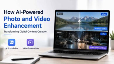
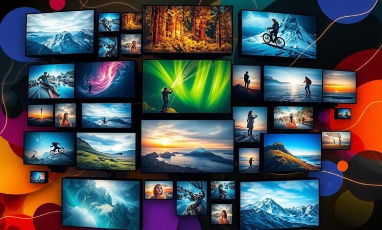
One of the biggest shifts in recent years has been the rise of accessible design tools that help people create professional visuals without needing a full creative team. Platforms that support quick experimentation—especially with concepts like AI poster creation—are changing how content gets planned, designed, and published. Instead of treating visuals as an afterthought, creators can build campaigns, blog graphics, announcements, and promotional materials as part of the storytelling process from the start.
The New Reality: Content Is Competing for Attention
Think about how people consume information today.
Someone opens a blog article while commuting. Another person scans headlines during lunch. A business owner checks updates between meetings. Nobody arrives with unlimited time.
That means every article, campaign, or page has to communicate value quickly.
Strong visuals do more than decorate a page—they guide attention. They create structure, reinforce messages, and make information easier to remember. Even a thoughtful article can lose impact if the presentation feels flat or difficult to navigate.
This doesn’t mean turning every post into a design project. It means being intentional.
Ask questions like:
- What should readers notice first?
- What emotion should the content create?
- What visual element supports the message?
- Where can imagery simplify something complex?
Those decisions influence engagement more than most people expect.
Why Posters Still Work in a Digital World
Posters have existed for generations because they do one thing extremely well: communicate quickly.
The format forces clarity.
You only have limited space, which means priorities become obvious. Whether promoting an event, announcing a launch, explaining an idea, or sharing a message, posters encourage focused communication.
That same principle works online.
Blog headers, social graphics, article previews, lead magnets, email banners, and social announcements all benefit from poster-style thinking:
- One core message
- Strong visual hierarchy
- Minimal distraction
- Clear action
Even content-heavy websites can benefit from adopting these ideas.
Visual Content Builds Trust Faster Than Most People Realize
People often assume trust comes purely from expertise.
Expertise matters—but presentation shapes perception.
Imagine finding two articles discussing the same topic.
One has structured sections, readable formatting, thoughtful graphics, and clear organization.
The other appears crowded and inconsistent.
Most readers unconsciously assign more credibility to the first experience.
That doesn’t mean style replaces substance. It means good presentation helps readers engage with substance.
For bloggers and publishers, this is especially important because readers frequently discover content through previews before reading a full article.
A Simple Framework for Better Visual Communication
Creating stronger content doesn’t require advanced design knowledge.
Start with these four principles:
1. Begin With Purpose
Before opening any design tool, define the goal.
Are you:
- Educating?
- Selling?
- Announcing?
- Inspiring?
- Growing an audience?
Visual choices become easier when the objective is clear.
2. Reduce Visual Noise
More elements rarely improve communication.
Remove anything that doesn’t strengthen the message.
Whitespace, contrast, and clean structure often outperform complicated layouts.
3. Design for Mobile First
Many creators still design while imagining a desktop experience.
But readers increasingly interact through phones.
Ask:
- Is text readable?
- Does the focal point appear immediately?
- Does the layout feel balanced on smaller screens?
4. Stay Consistent
Consistency builds recognition.
Use similar:
- Typography
- Tone
- Spacing
- Image style
- Layout patterns
Readers may not consciously notice consistency—but they feel it.
Real-World Example: Turning One Idea Into Multiple Assets
Imagine publishing an article about productivity.
Instead of stopping after the blog post, you could create:
- A visual quote for social sharing
- A simple announcement graphic
- An email banner
- A downloadable checklist
- A thumbnail for promotion
One piece of content becomes multiple touchpoints.
This approach helps creators get more value from the work they already do.
It also reduces creative pressure because you’re building from an existing message rather than starting over every time.
The Balance Between Speed and Quality
There’s a common belief that good design must take a long time.
In reality, effective creators usually optimize systems rather than effort.
Templates, repeatable workflows, and smarter creative tools allow people to maintain quality without slowing down production.
That’s especially useful for solo creators, growing blogs, and teams managing multiple channels.
Speed only becomes a problem when it replaces intention.
The goal isn’t producing more content.
The goal is producing content people remember.
Final Thoughts
Great content isn’t only about having something valuable to say—it’s about making that value easy to experience.
Visual communication has become part of modern publishing, whether you run a blog, manage a brand, or create content independently. The strongest creators understand that words and visuals aren’t competing with each other; they work together.
When ideas are clear and presentation supports the message, readers stay longer, engage more deeply, and remember what they’ve seen long after they leave the page.